System Image
Overview
The System Image component is designed for displaying images stored in your app’s asset library or bundle. It supports various file types, including PNG, JPEG, and HEIC, making it versatile for integrating a wide range of images into your app's UI.
The SystemImage Component is currently available only for iOS.
Sample JSON
Below is a sample JSON object demonstrating how to define a System Image component with various data and style properties:
{
  "type": "systemImage",
  "data": {
    "imageName": "myImage"
  },
  "style": {
    "height": 200,
    "width": 250,
    "scale": "fit",
    "cornerRadius": 24,
    "padding": {
      "top": 5,
      "right": 0,
      "bottom": 5,
      "left": 0
    }
  }
}
This results in the following output:
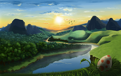
In this example, the System Image component displays an image named "system_image" from the app's asset bundle with specified style properties:
- Height and width set to
200and250logical pixels, respectively. - Scale mode
fitto ensure the image fits within the given dimensions while maintaining its aspect ratio. - Corner radius of
24for rounded corners. - Padding of
5logical pixels on thetopandbottom, with no padding on theleftandright.
Data Properties
The data properties define the source of the System Image component. The following table lists the available data property for the System Image component:
| Property | Type | Required | Description |
|---|---|---|---|
| imageName | String | true | Specifies the name of the image in the app's asset bundle to be used as the content. |
imageName
- Type: String (required)
- Description: Identifies the image file from the app’s asset library or bundle. The name should match exactly with the file name stored in the assets, including handling different resolutions or device-specific assets.
Style Properties (Optional)
Style properties allow you to customize the appearance of the System Image component.
The style properties are optional. If you don't specify any style properties, the System Image component will use the default values.
The following table lists the available style properties for the System Image component:
| Property | Type | Required | Description |
|---|---|---|---|
| height | Float | false | The height of the image in logical pixels. |
| width | Float | false | The width of the image in logical pixels. |
| scale | String | false | The scaling mode (e.g., "fit", "fill") to adjust the image size. |
| cornerRadius | Float | false | The radius for rounding the corners of the image in logical pixels. |
| padding | JSON | false | The padding around the image component. |
height
- Type: Float (optional)
- Description: Defines the vertical size of the image in logical pixels. Setting this property allows you to specify the height of the image, ensuring it fits well within the layout of your app's UI. A value is not mandatory; if omitted, the image's natural height or the height derived from other style constraints will be used.
width
- Type: Float (optional)
- Description: Determines the horizontal size of the image in logical pixels. This property lets you control the width of the image, allowing for precise placement and scaling within your app's interface. Like height, specifying a width is optional; without it, the image will default to its natural width or adapt based on other styling rules applied.
scale
- Type: String (optional)
- Description: Determines how the image is resized to fit its container. Options like "fit" and "fill" control how the image adapts to the provided dimensions, maintaining aspect ratio or covering the space entirely.
cornerRadius
- Type: Float (optional)
- Description: Sets the radius for rounded corners of the image, enhancing its visual appeal with a specified curvature.
padding
- Type: JSON (optional)
- Description: Defines the space around the component. The padding is specified for top, bottom, left, and right individually. Each subproperty is an integer representing the number of logical pixels for the padding.
top: The space above the component.bottom: The space below the component.left: The space to the left of the component.right: The space to the right of the component.