Creating a UI Card Component with Televo
In this guide, we dive into the creation of a UI card component using Televo, tailored for developers eager to enrich their mobile applications with engaging and versatile elements. The card component we're focusing on is designed to display products, articles, profiles, and more, with an emphasis on adaptability to both light and dark themes for a consistent user experience across various devices and settings.
Overview
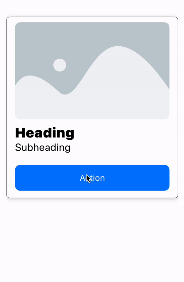
Our UI card component stands out with its blend of visual appeal, functionality, and adaptability, featuring:
- Network Image: A striking visual representation fetched from a URL.
- Heading: A bold title that captures the essence of the card's content.
- Subheading: Additional context or information, presented in a slightly smaller text.
- Elevated Button: An interactive element that prompts user action, such as navigating to a new page or expanding details.
Complete JSON Structure for the UI Card Component
Below is the JSON structure that outlines the layout and styling of our UI card component, providing a foundation for customization and integration within various development environments.
{
  "type": "card",
  "style": {
    "height": 420,
    "backgroundColor": "#ffffff",
    "backgroundColorDark": "#000000",
    "borderColor": "#000000",
    "borderColorDark": "#ffffff",
    "borderWidth": 1,
    "cardElevation": 2,
    "shadowColor": "#000000",
    "shadowColorDark": "#ffffff",
    "shadowRadius": 5
  },
  "data": {
    "child": {
      "type": "column",
      "style": {
        "padding": {
          "top": 12,
          "right": 16,
          "bottom": 16,
          "left": 16
        },
        "alignment": "leading"
      },
      "data": {
        "children": [
          {
            "type": "networkImage",
            "style": {
              "height": 225,
              "scale": "fill",
              "cornerRadius": 12
            },
            "data": {
              "imageUrl": "https://developers.elementor.com/docs/assets/img/elementor-placeholder-image.png"
            }
          },
          {
            "type": "text",
            "style": {
              "fontSize": 32,
              "fontWeight": "black"
            },
            "data": {
              "text": "Heading"
            }
          },
          {
            "type": "text",
            "style": {
              "fontSize": 24,
              "fontWeight": "regular"
            },
            "data": {
              "text": "Subheading"
            }
          },
          {
            "type": "elevatedButton",
            "style": {
              "height": 60,
              "padding": {
                "top": 12
              }
            },
            "data": {
              "child": {
                "type": "row",
                "data": {
                  "children": [
                    {
                      "type": "spacer",
                      "data": {
                        "minLength": 10
                      }
                    },
                    {
                      "type": "text",
                      "style": {
                        "fontStyle": "body1",
                        "fontColor": "ffffff"
                      },
                      "data": {
                        "text": "Action"
                      }
                    },
                    {
                      "type": "spacer",
                      "data": {
                        "minLength": 10
                      }
                    }
                  ]
                }
              },
              "action": {
                "type": "sheet",
                "payload": {
                  "data": {
                    "children": [
                      {
                        "type": "column",
                        "style": {
                          "padding": {
                            "top": 20,
                            "left": 16,
                            "right": 16
                          }
                        },
                        "data": {
                          "children": [
                            {
                              "type": "networkImage",
                              "style": {
                                "height": 300,
                                "scale": "fit",
                                "cornerRadius": 12
                              },
                              "data": {
                                "imageUrl": "https://developers.elementor.com/docs/assets/img/elementor-placeholder-image.png"
                              }
                            },
                            {
                              "type": "spacer",
                              "data": {
                                "minLength": 10
                              }
                            }
                          ]
                        }
                      }
                    ]
                  }
                }
              }
            }
          }
        ]
      }
    }
  }
}
Detailed Explanation of the JSON Structure
The JSON structure is the backbone of our UI card component, dictating how it is rendered within an application. Let's delve into each part of the JSON to understand its purpose and functionality.
Top-Level Card Object
{
  "type": "card",
  "style": {...},
  "data": {...}
}
- type: Specifies that the object is a card.
- style: Contains styling properties for the card, like background color, border, and shadow.
- data: Encapsulates the content structure within the card.
Style Object
This object defines the visual attributes of the card:
"style": {
  "height": 420,
  "backgroundColor": "#ffffff",
  ...
}
- height: Specifies the card's height.
- backgroundColor and backgroundColorDark: Set the card's background color for light and dark themes, respectively.
- Attributes like borderColor, cardElevation, and shadowColor further customize the card's appearance.
Data Object and Its Children
The data
object outlines the card's internal content layout:
"data": {
  "child": {
    "type": "column",
    ...
  }
}
- child: A layout object (e.g., a column) that organizes the card's elements vertically.
Column Structure
"children": [
  {"type": "networkImage", ...},
  {"type": "text", ...},
  ...
]
Each child within the column represents a component of the card:
- networkImage: An image element.
- text: Text elements for the heading and subheading.
- elevatedButton: An interactive button component.
Interactive Button
The button is designed for user interaction, leading to actions or additional content:
{
  "type": "elevatedButton",
  "style": {...},
  "data": {...}
}
- style: Customizes the button's look.
- data: Defines the button's content and the action it triggers.
Conclusion
This documentation has detailed the creation and customization of a UI card component using Televo, focusing on both its design elements and the underlying JSON structure. The JSON schema provided serves as a template for developers to adapt and integrate the card component into their applications, ensuring a compelling user interface that enhances user engagement and experience. By understanding and leveraging the JSON structure, developers can efficiently customize the card's appearance and functionality to suit their specific needs.